5 Ways Your Charity Newsletter Signup Process Might Be Scaring Away Subscribers
Almost every charity has a newsletter. And that’s good. They help cultivate your donor base, keep your supporters informed, and allow new visitors to learn about your organization without committing to anything.
The problem is, many nonprofits (and businesses) that have a newsletter aren’t seeing nearly as much growth result from them as they would like.
Is that because charity newsletters are just another trend that too many nonprofits don’t have the time or the resources to keep up? Are you better off focusing on more immediate tasks?
On the contrary, email engagement remains the number one method of securing and building relationships with donors and supporters. Few people go and visit the same websites regularly. They need something to nudge them there. Social media is one way, but that doesn’t allow for rich content delivery the way e-newsletters do, and it’s much more prone to distraction.
However, once someone signs up for your charity’s newsletter, it becomes your primary means of communication with them. It’s your first opportunity inform them of new projects, inspiring stories, updates on data and finances, and staffing changes.
A nonprofit that uses its newsletter effectively will strengthen long term donor support, and will continuously expand its donor base.
If the newsletter has this much potential, then getting people to sign up for it isn’t a minor task. It’s a major priority – one of the easiest gateways into your charity work.
So why aren’t more people signing up for your newsletter?
Here are five primary reasons your newsletter may be failing to engage and attract new subscribers.
1. A Muddled or Invasive Call to Action
This is by far the most common weakness in the newsletter signup process. Especially for nonprofits. Here’s an example of what many sites do:
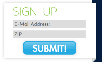 Put yourself in a new visitor’s shoes for a moment, and imagine arriving at your site and finding this.
What would hinder you from signing up? I see three major roadblocks:
- It asks for my zip code. Why do they want that? This feels invasive to me. I just want the newsletter. I don’t see any reason why you need this information. It makes me suspicious.
I once got an email saying I could get a free gift card for a restaurant. But to get the gift card, I had to give tons of personal information. Even though a free gift card sounded great, I just couldn’t bring myself to sign up for yet another list I don’t want to be on. So I left the page.
- “SUBMIT!” On one hand, this may not seem like a big deal. Lots of pages ask us to “submit” our information. But is this really the best word to use for this button? Does this word get me excited about whatever I’m signing up for? It conveys a rather formal tone, as if I’m submitting my tax forms. Or, taken out of context, I could take it as ordering me around – and the exclamation point doesn’t help in this regard.
- “Sign up.” This is the most glaring problem. Sign up for what? I have not a single clue what I’m getting if I sign up. You might think that by now, users expect sites to have newsletters, so they’ll know what this means. But will they? And, even if they do know what it means, is this enough to make them sign up? It gives no specific information that will reinforce or motivate them to learn more.
The lack of information, poor clarity, uncertain messaging, and invasive requests for personal information make this a very ineffective newsletter signup form.
Making matters worse, a different page of the same site had this form:
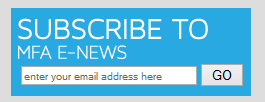
Compared to the other opt-in form, this one has different messaging, doesn’t ask for the zip code, and says “go” instead of “submit” on the button copy.
This inconsistency is enough to make me as a user wonder if this is even for the same newsletter.
As such, if I was already unsure about signing up, this confusion confirms my decision:
I leave the form blank.
2. No clear benefits
Just like muddled messaging doesn’t speak to the needs of the visitors, most nonprofit websites give no positive reasons to sign up for their newsletters.
They just say a phrase like the above example – “Sign up for our newsletter” – a phrase that appears on thousands of websites.
This is one of the best opportunities to give your charity some distinction. Set yourself apart from the thousands of other nonprofits – many of whom have missions similar to yours.
If all you do is provide an opt-in form with a generic statement like this, then you are relying completely on the rest of your site’s content to motivate visitors to sign up.
The problem with that is, the rest of the site is not about the newsletter.
Even more important, the majority of your site does not feature calls to action.
(ProActive Definition: What’s a ‘call to action’? It refers to any feature that compels a visitor to do something. Donate, Buy Now, Sign Our Petition, Write a Letter, Sign Up, Click Here – these are actions visitors can take based on whatever they have seen and read up to that point. And they can all be measured. A call to action is a message given to visitors that asks for a specific step in response).
The majority of your pages have other purposes – explain your mission, promote your work, help connect visitors to services – all sorts of things. But the newsletter signup is a specific action you want certain individual visitors to engage with.
Picture two clothing stores with shoe displays near the entrance.
One store has a sign in the window: “sale.”
The store next to it has a different sign: “50% off all women’s shoes.”
If you’re looking for shoes, which one would you visit?
In the same way, the e-newsletter call to action needs to give specific and appealing benefits that compel visitors to want to sign up.
Here’s an example of how this can look. This is for an outdoor preschool called Tiny Trees:
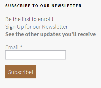 How much better is this than what you see on most websites?
There is still very little copy. But look at what’s contained in this tiny little box:
- Clarity – this is where you sign up for the newsletter
- Benefit – the newsletter will help visitors be first to enroll (which also gives them incentive to sign up now, because it subtly implies there is a waiting list, and I want to be high on that list)
- Additional information – there’s a link to a separate Subscription Page where the uncertain visitors can learn more about what’s in the newsletter. Almost no nonprofit websites are using this approach – and they are losing almost all their “on-the-fence” visitors as a result.
- A button call to action that makes it clear what you’re doing when you click.
Also, it doesn’t even ask for a first name. Do you really need one at this point in the process?
(ProActive Data: This was part of the Tiny Trees launch back in October 2014. Five months later, they had 270 enrollees).
3. Newsletter Opt-in Form is Buried
This one’s pretty obvious, but also terribly common.
I study nonprofit sites. I’ve looked at tons of them. Many times, I have to scour through many pages before I finally stumble across the newsletter sign up form.
Sometimes it’s a simple text link down at the bottom of the page.
Other times it only shows up on a secondary page or two.
If people don’t find your sign-up form just by viewing your site as they naturally would, then your form is too hard to find.
Experts recommend putting the call to action on the top right or on the right side of the home page.
But even if that doesn’t work within your site design, if your newsletter is an important part of growing your organization (and it should be!), then you need to find a place where it is featured prominently.
4. Confusing Signup Process
Some sites have a well-placed and clear signup form, but when the visitor actually puts in their information, that’s where the trouble starts.
I once signed up for a charity newsletter, and was asked about seven different areas of ministry I was interested in, such as veterans, homeless adults, troubled youth, etc. It was incredibly confusing. Several questions came to me immediately:
- Is there really a separate newsletter on each of these topics? (hard to believe…it makes the organization seem un-credible or disorganized)
- Are these even related to the newsletter, or is this some kind of marketing ploy?
- What am I missing out on if I don’t check every box?
- Am I going to get bombarded with emails if I check them all?
So, I was a new visitor who wanted to sign up, and yet I stalled at this step. Had I not been doing this for professional growth purposes, I would have left.
There are other confusing methods many sites are using. For example:
-Some ask for too much information, like full name (why do you need my full name?), address, and phone number.
-Others ask questions the average visitor might not understand. Questions like “Are you interested in receiving updates on ____ ?” are confusing. Why would I be signing up for the newsletter if I wasn’t interested?
-Also, don’t give too many options or boxes to check. Make it simple. The newsletter is free. The signup should be simple. This is your first method of engagement – your introduction – to new prospective donors and supporters.
Later, after you’ve built up trust and credibility through your professionally written and engaging content, they’ll happily give the other information.
So, to optimize your process,
Here’s your charity newsletter signup evaluation guide:
- Is it simple? Make it one-step-simple.
- Do you have several newsletters with different names? Unless it’s crystal clear what each one is about, who it’s for, and why a person might choose each one, this muddles the process.
- Do you ask unnecessary or invasive questions about personal information?
- Are you giving them too many decisions to make? Every choice is an opportunity to get stuck if the visitor doesn’t have enough information. Don’t give them new reasons to get stuck.Make it simple – one step.
Here’s an example of a very confusing process.
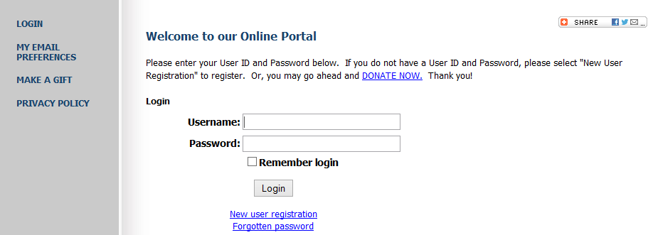 (Please note – this particular nonprofit is doing great work – and I’m not naming them because my point isn’t to make them look bad. This is merely a learning exercise, and it’s an area they could improve.)
Look at this page. Is there a single item on the screen that makes you want to sign up for this?
Do you know what you’re signing up for?
It sounds like a database, or some task to be done at work. “Welcome to our online portal” does not communicate warmth, humanity, concern, empathy, passion, engagement – none of the qualities that motivate people to get involved with nonprofit work.
Website visitors only have so much time. They have thousands of places they could go besides your site. A page like this assures you of continued underperformance for your e-newsletter membership.
5. No follow-through
Suppose your nonprofit takes all this to heart.
You put your sign-up form in a clear place on your page.
You clarify the messaging, and give a specific benefit.
You simplify the process and remove confusion and invasiveness.
And, you even have your copywriter create a separate Subscription Page for the fence-sitters.
But then, you have to follow through.
I have subscribed to dozens of nonprofit newsletters. Interestingly, I only receive regular newsletters from about half of them.
Some of the ones I’ve signed up for have never sent me a single email.
Others send me one or two per year.
Almost none of them send a welcome email.
The point is – if someone signs up for your newsletter – thank them!
Follow-Through Step 1: Send an autoresponder welcome email.
A welcome email is a short email written or edited by a professional copywriter that thanks the person and gives a friendly greeting. This simple and personal acknowledgement makes the new subscriber feel like a real person, reinforces their decision to sign up, and shows them their interest in your organization is valued.
Follow-Through Step 2: Keep them engaged.
Make sure you have a regular newsletter. That is what they signed up for.
If they sign up, get one email, and then hear nothing for three months, what’s going to happen?
Disengagement. They’ll forget about you, and become another potential supporter and donor that fades away.
What do we do after they sign up for our e-newsletter?
Once you have a well-tuned e-newsletter signup process, then you need to utilize it.
You need quality, consistent, and effective content with non-pushy calls to action.
I’ll discuss that in a future article.
In the meantime, if you need help getting more people to sign up for your newsletter, send me a message explaining your situation, and I’d be happy to consult on your process.