How to Get More People to Read Your Nonprofit’s Emails
7 Email Copywriting Strategies to Engage Readers and Drive Response
Getting your nonprofit’s emails opened is one thing. But getting people to read the whole email is quite another. It doesn’t do much good if people open your emails but then just read the first couple sentences.

Get your email subscribers to read ‘the whole enchilada’
Image by ALFONSO CHARLES from Pixabay
The good news is, there are some specific strategies you can use – and they are not difficult – that will motivate more people to read your nonprofit’s emails after opening them.
ProActive Content uses these same strategies in the emails we produce for our nonprofit clients. Fundraising copywriting is, like any other form of copywriting, built upon grabbing and holding the attention of a reader long enough to get them to engage with your message.
Here are a few simple ways to do that.
1. Create a ‘Double Readership Path’
The great thing about email, or direct mail for that matter, is that by using what’s called the double readership path, you can get people to read your whole email without reading the whole email.
Huh?
The idea is, by using subheadings and other textual emphases we’ll discuss in a moment, you can create a path for someone to read only certain parts of the email, and still understand the core message enough to consider responding or going back and reading more details.
Whatever your core message, map out the outline for it, and structure your subheadings so that key points within that core message appear in the subheadings. The idea is, even if all a person reads is the subheadings and the call to action at the end, they understand what the email is about.
At the same time, someone who wants to read the entire thing still can. So there are two ways – two paths – to read an email or a direct mail letter that uses this approach.
Why do this? Because people are busy, and we know not everyone who opens an email or a direct mail envelope will read the entire thing. In fact, most probably do not. When you create a double readership path, they don’t need to, because they will still have read enough to think about responding.
Using subheadings is more important than using images. That doesn’t mean to not use images. But if you want to focus your efforts on what provides more motivation for a reader to take action, in general it is the writing and not the images.
An image gets attention, but it doesn’t drive the reader to action. The words do that. (If you don’t believe that, try creating an advertisement for anything with no words and just images, and then watch how no one responds)
2. Use Textual Emphasis to Deepen Readership Path
Sometimes subheadings aren’t enough. If the email is only 400 words, you can’t put more than one or two subheadings in there without it looking silly.
You can supplement your second readership path by emphasizing key elements of your message with bold, italics, underlines, and different colors and types of fonts.
Just like subheadings, the eye is naturally drawn to these things. For a person who doesn’t want to read the whole email and prefers to skim, they will look at whatever calls out to their eye. Bolds and different colors and these other simple tools achieve that.
Copywriting testing data has shown for decades that the two most-read parts of any letter are the headline and the P.S. What does that tell us? It means a lot of people read the opening, skim the middle, and then read the end.
Call out to their attention using textual emphases, and you will get more of these people to stop along the way and read more details.
Just be careful not to overdo it. If you have bolds and underlines in every paragraph, it loses the effect.
3. Include at Least One Teaser
The longer the email or letter, the more teasers. What’s a teaser?
It’s when you mention something but then tell them you’ll have more to say about it in a moment. If you noticed, we did this in the article you’re reading now. Early in the first point, you read this part of a sentence:
“…by using subheadings and other textual emphases we’ll discuss in a moment…”
If you weren’t sure what ‘textual emphases’ meant, that line keeps you reading because you want to know what it is and how it helps more people read your nonprofit’s emails.
In emails, the best place for a teaser is in the opening line. (See 8 outstanding opening line strategies for email, with tons of real examples) If not the opening line, put one soon after within the first few lines. Give readers a taste of something, but then make them keep reading to get the full experience or revelation.
In longer emails and letters, you can do this multiple times throughout. TV news shows do this constantly, usually before commercial breaks. Why? To keep you watching. Does it work? They wouldn’t all do it if it didn’t.
4. Write Small Paragraphs
 Small paragraphs are easier to read than longer ones. That’s why all the blogs we write – for this site and for all our clients – use short paragraphs. It’s a very deliberate strategy that speeds up the read.
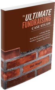
ProActive Content founder Dan Magill believes in this strategy so much he even used it in his book, The Ultimate Fundraising Case Study. And it works. Readers have told him they’ve read the entire book in just a few days. It’s a fast read because of how it is structured.
We’re not going for literary prizes. We’re going for engagement with our message and consumption of our content.
5. Keep to a Single Message
For newsletters, you can break this rule because people expect to see multiple topics. But if your email is written for a specific purpose, like raising money, event signups, volunteers, or other purposes, stick to a core message.
Whatever your core focus is for that email, that will guide you in knowing which parts to highlight with textual emphases and subheadings. For fundraising emails in particular, you also want to emphasize moments that reveal the donor’s impact, like parts of a story that shows what’s at stake.
6. Use Indents and Call-Out Boxes
Too much formatting doesn’t work on emails anymore because mobile has ruined most of those options. But if you have a particular line, or a quote, or a paragraph you really want everyone to see, one way to make sure they read it is to indent the whole paragraph.
Sometimes, we will also italicize or bold the whole thing too. Again, the thinking here is, “If they read nothing else, we want them to read this.”
If you feel that way about a particular element of an email or direct mail piece your nonprofit is working on, call it out so they can’t miss it. In direct mail, the call-out box works well for this. Put a quote or a line or a testimonial in its own box to the side so even a casual reader will look at it.
7. Include Call to Action Links at Key Moments
As much as you want them to read your nonprofit’s emails, you want them to act on them even more.
A great strategy for this is to insert call to action links throughout the email, not just at the end. When you can make it work, it’s very effective to make the CTA link the ‘answer’ to a question or suggestion just made. For instance, here’s some copy from ProActive Content, written for a Giving Tuesday campaign:
Are you ready to stand with these people, your neighbors, this Giving Tuesday?
Here’s my Giving Tuesday Gift
Now to be clear, this is not the end of the email. Just a slice from the middle, with no context. But notice how the link is the ‘answer’ to the question. Sometimes you don’t even have to phrase it as a question. The unwritten answer is ‘Yes, I do want to stand with them.’ And to do so, here’s the link.
Here’s another example from a Covid campaign written earlier this year:
If you know someone who has been greatly impacted by this virus and the government lockdown, there is help available.
Send this link to anyone you know who needs help
Imagine reading the first line and thinking of someone you know who is suffering because of the government lockdowns. They are on your mind, but you don’t know what to do for them. The text promises help, but where is it?
The help comes in the form of the link on the next line.
This type of call to action will not say ‘Donate’, most of the time. It will use language that fits within the flow of thinking happening at that point in the email.
This is also a better approach than saying “click below to send your Giving Tuesday gift,” or “Click below for a resource you can send to someone you know who needs help.”
See the difference?
The link IS the solution to what’s going on in the reader’s mind. This approach actually shortens your emails because it removes an unnecessary line of copy, and it also keeps them in their state of mind, rather than pulling them out of it and making them decide if they really want to click on this link.
Increase Email Readership
Use all these strategies when you write emails for your nonprofit, and more of your readers will engage more deeply with your emails. It works with direct mail letters too. And again, they are not hard to use. You’re still writing the same stuff. You’re just framing and structuring and presenting it differently.
Here again are the seven strategies to get more people to read your nonprofit’s emails:
- Create a ‘Double Readership Path’
- Use Textual Emphasis to Deepen Readership Path
- Include at Least One Teaser
- Write Small Paragraphs
- Keep to a Single Message
- Use Indents and Call-Out Boxes
- Include Call to Action Links at Key Moments
Want help creating emails from a fundraising copywriting specialist?
ProActive Content probably writes more email fundraising than any other form of fundraising copy. We have gotten very good at it.
Kevin Hunter, Executive Director for Construction for Change, said this after we worked on several different email campaigns for them:
“Dan helped us move our overall communications quality and timeliness forward in a very positive way. The overall consistency and storytelling of our impact that we provided for our stakeholders improved. And our monthly giving program took a step forward as well as being able to attract new donors”
Want more content? Get weekly nonprofit fundraising and copywriting tips, strategies, and motivations in the ProActive Insights newsletter.


