7 Nonprofit Newsletter Examples and Ideas from Real Charities
See Screenshots and Analysis for 7 Types of Email Newsletters
Some nonprofits get a little too stressed about the idea of email newsletters. Allow me to simplify it for you.
An email newsletter is really just an email.
There was a time when nonprofits tried to send out emails meant to look like actual newsletters, with links to several different stories and articles the reader could click on. The better newsletters would have a headline and a little teaser about each article. Sometimes an image to go with it.
These weren’t meant to be read word for word. They were meant to give readers options for ways to pursue their interests among an array of choices.
Does that style of newsletter still work?
Yes, as long as it’s designed for an easy quick scan, and the main messages and most critical links are easy to find. You’ll see an example of one in a bit.
But really, when we talk about emailed nonprofit newsletters, it’s just an email. When a person signs up for your newsletter, they are expecting to hear more about your organization, the impact they can have, how they can get involved, and possibly giving.
Deliver on those things, and anyone who is attracted to your work and wants to be part of it will stick around. Those who decide it’s not for them will either cancel or just stop opening your emails.
So relax.
Here are seven examples of nonprofit newsletters to give you content ideas, and to show what matters most in design (hint: It’s layout, not pictures and backgrounds).
Nonprofit Newsletter Example #1: Breaking News from Equality Now
Use this style of newsletter when you’ve got big news to share. But don’t abuse this kind of thing. Nobody has big news every single week. If you try that, your readers will eventually ignore you. It’s like the children’s fable about crying wolf.
Here’s a terrific example of a ‘news’ style nonprofit newsletter from Equality Now. The whole email is about one thing (a good practice for email in general) – how Noura’s unjust death sentence was revoked by a local court.
Equality Now wanted to share this news to show how their readers’ involvement makes a difference. This particular nonprofit does a lot of social action like signing online petitions. So when a case they’ve been fighting for gets won in their favor, their readers will want to hear it.
And take note: Even though this is a pure ‘news’ story, they still have a donate button at the end. Why? Because if someone loves this news enough to give, you aren’t doing your job if you don’t give them that opportunity.
Nonprofit Newsletter Example #2: Event Promotion from Genesis Project
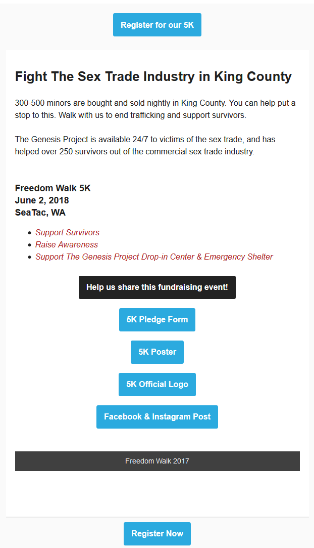
This is a really short one. Does it still qualify as a newsletter then? YES. Because a newsletter is really just an email.
As you can immediately see, The Genesis Project fights sex trafficking, and they do an annual fundraising 5k walk in the summer. They promote it for a couple months beforehand, so this is not the only email about it (that would be very bad email practice).
But this is a good example of one email about the event for several reasons:
- Emphasizes the impact you will have if you attend their 5k (in headline, in copy, and in red bullet points)
- Gives several links the reader can use to promote the event
- Gives two buttons for signing up – at the beginning and at the end (an email newsletter best practice for whatever your primary call to action is)
- Gives event details (though it should also give the specific location where it starts)
You’ll also notice in most of these newsletter examples that few images appear. That’s because I have images disabled in my email. This email actually has several photos and even a video from last year’s event (that’s what the ‘Freedom Walk 2017’ black bar refers to).
I point this out, as I have many times in the past, to remind you that it is very bad newsletter practice to fill your email with graphics and photos with no text.
Putting photos in is fine, and for an event promotion newsletter like this, showing photos and a video from last year is a terrific idea because it builds credibility. But half your readers won’t see them unless they enable images.
This newsletter from GP works because it has enough information for readers like me who have images disabled, and then has more visuals for people who will see them.
Do NOT bury critical information only in graphics. Put it in the text so ALL your readers see it.
Nonprofit Newsletter Example #3: Telling a Story from Plan USA
Plan USA has come a long way, and I’m happy to use their example here.
There was a period of time when they violated the newsletter best practice I just referred to about not filling emails with graphics. For a while, their emails were all graphics and nothing else. When I opened those emails, I saw nothing at all.
But they made a change for the better some time ago, and now they put out excellent newsletters like this next example.
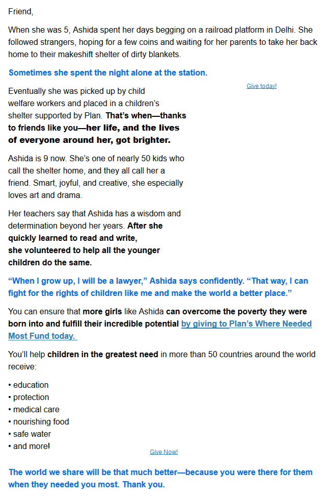
This is a story-telling newsletter. Fundraisers talk about the need for stories all the time. And we’re right, because stories are powerful. Read this one and see if it doesn’t make you want to take action.
Also – note how nice it looks even though I can’t see the images. I can tell there IS an image in a couple places, so that might make me want to enable images. But I can read the whole story without them. (And they even snuck in a ‘Give Now’ link in the alt text of the image – very smart, though I prefer to describe the photo when I write alt texts).
Good use of colored and bold text too makes it easy to skim and get the main points.
Nonprofit Newsletter Example #4: Survey Engagement from ASPCA
How can we not include a fuzzy animals newsletter?
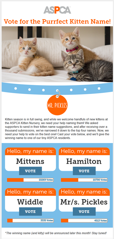
With cute animals, it’s pretty tough to avoid pictures. You must use them in almost every email if they’re relevant to your charity. And as a reader who normally doesn’t show images, I’m going to enable them for these emails almost every time – especially in this delightful newsletter where I get to vote on a name for a new kitten in one of their animal shelters.
I think I voted for Hamilton.
This is an example of an engagement style newsletter with the goal of filling out a survey. Notice they don’t ask for a donation anywhere. Is that okay? Sure it is – ASPCA sends a lot of emails, and almost every one of them asks for money somewhere.
So they took a break on this one because this is purely about the survey. On email especially, it’s important not to wear out your readers by asking for money all the time, especially if you send out multiple emails per week like ASPCA does.
If you’re doing a survey, that is the purpose of your email, so keep the focus on that.
Nonprofit Newsletter Example #5: Traditional Newsletter style from Bikeworks
At the beginning I said the traditional approach of putting several different topics in your newsletter can still work.
Here’s a great example of that from Bikeworks. They’ve got four different topics, each with a super clear headline, an appropriate link, and enough copy to help the reader decide if they want to know more.
They also put images in each section (the blank spaces), but again, I have images disabled.
Nonprofit Newsletter Example #6: Social Action from Shared Hope
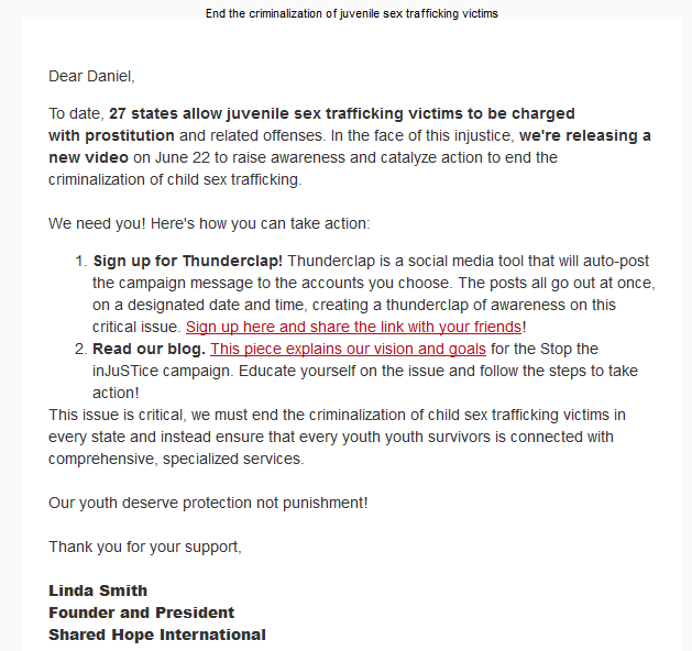
Here’s a great example of a call to action newsletter with the goal of getting people to advocate for the cause.
This is from Shared Hope International, which fights human trafficking around the globe, including on the legislative side.
In this email, they want people to use Thunderclap to spread awareness on a specific day through social media by sharing a video. Then, they’re also promoting a new blog on their website, which readers can choose to share.
This charity also sends out a lot of emails that ask for donations. They do a lot of matching gifts campaigns. But like ASPCA, this newsletter has a different purpose, so there’s no ask for donations.
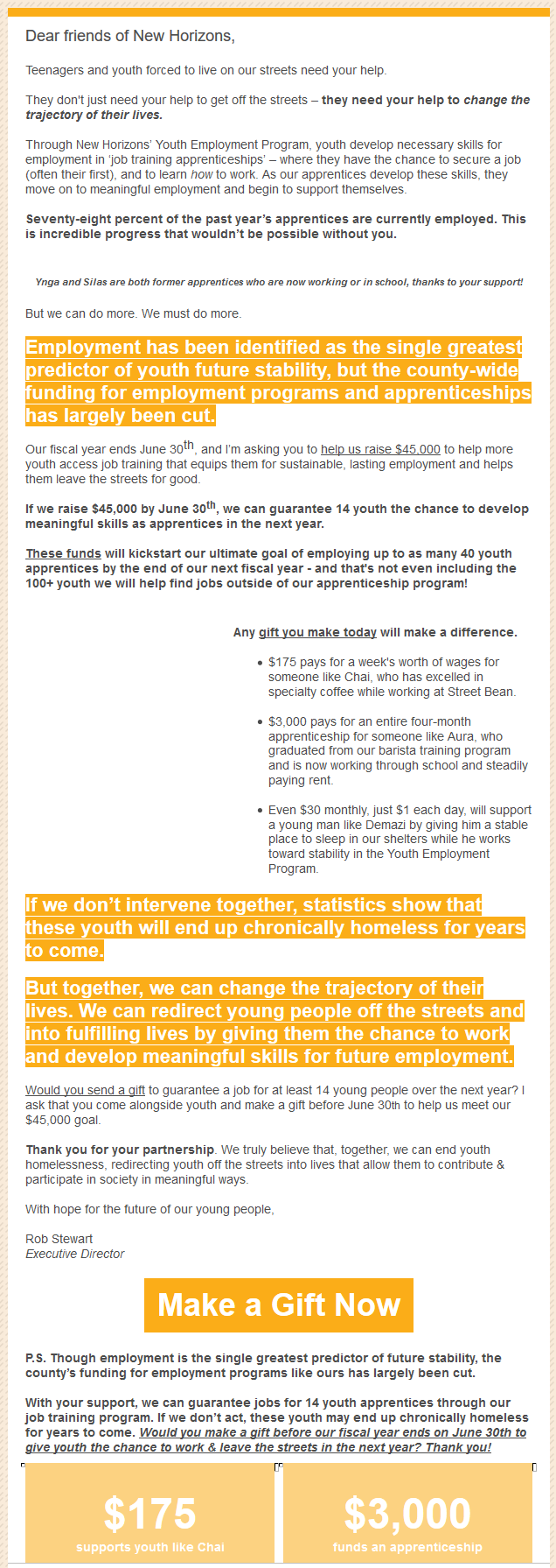
Nonprofit Newsletter Example #7: Donation Email from New Horizons Ministries
Here’s a pure fundraising newsletter that tells a story, describes the impact the donor can have, and presents a clear call to action with various giving options and a P.S. It uses color, bold, and buttons.
This email is also a good length. It is NOT too long, though some are probably wringing their hands about that (no one forces anyone to read the whole thing… what are we afraid of?)
In this newsletter, New Horizons Ministries describes the specific impact on homeless youth that a donor can have if the goal amount is reached. They also include a few photos – you can see the alt text written where the photo will be if we enable images. Using image alt text descriptions like these is an email newsletter best practice, because then all your readers benefit from the photo, even the ones who can’t see it.
If you’re confused on what I mean by ‘alt text,’ one alt text below reads “Ynga and Silas are both former apprentices….”. If I enabled images, that text would disappear and a photo would show in its place.
How Many Emails Are You Sending Out?
You should probably be sending more. Here’s an article with more on this oft asked question.
If you don’t have time to send more, get help. Writing emails doesn’t take much time or money, and the impact is significant.
Get fundraising email copywriting from ProActive Content – we work with ANY budget no matter how small the nonprofit.
If you don’t think you have enough ideas or content to write about consistently, you might need help making a plan to come up with more. If your nonprofit is active, you have content ideas. You just need to narrow them down to specific ones that will work in an email. This might also mean improving your internal communications so your email copywriter gets the information.


