Donation Page Giving Options – Testing Data Uncovers Huge Revenue Loss from One Simple Change
On your donation page, how should you present your giving options?
Your three main giving options are:
- Only an open-ended field with no suggested giving amounts
- One or more suggested amounts
- Both suggested amounts and an open field for other amounts
But within those three options lie many more variations and subtleties.
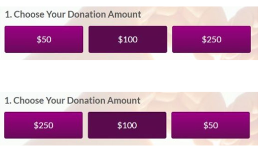
A recent test studied the difference between listing your donation page giving options from highest to lowest and lowest to highest, both versions of which can be seen in the graphic below.
To be clear, there was more on the page besides this, but the order of the giving options was the only difference between both versions of the donation page.
Half the visitors saw the highest giving amount listed first, and the other half saw the lowest amount listed first.
Which one do you think got more donations?
(pause for deep rumination music…)
Before revealing the answer, think about how important this is. You use giving options not just on your online donation pages, but in your direct mail. It’s a safe bet the same results will happen there as with an online form.
And in this case, the difference in results was pretty stark. Here’s the data:
The donation page giving options with the highest amount listed first ($250) failed in two ways, both very detrimental to your revenue.
First, it brought in 15.7% fewer gifts. That means fewer people gave, and by a wide margin. If 100 gave to the donation page with the $50 listed first, then only 85 gave to the other one. That’s a huge difference.
Second, the high-to-low donation page saw an 11.3% decrease in the average gift size.
So not only are fewer people giving, but they’re giving less. Altogether, the donation page that listed the highest amount first earned 25.2% less revenue than the one putting the lowest amount first.
Why High-to-Low Giving Options Attract Fewer Donors
 Most of the reasoning on why test results like this happen ends up being very speculative. So I prefer not to dwell on all the possible reasons.
For me, the simplest explanation is that large numbers scare more people away – especially online for a general audience. So if the largest number is the first thing they see, more of them will be turned off.
As for why the average gift size also came in lower, that’s a little harder to explain.
The bottom line is, for one reason or another, presenting donors with the highest amount first seems to turn them off.
The researcher conducting this test, Jon Powell, goes into great depth into why he believes these results came out the way they did. If you’re interested in that, read his explanation here.
Donation Page Giving Options: Put the Low Number First
This applies to direct mail as well, but the takeaway here is pretty clear.
Put the lowest number first, and you can expect more gifts and higher amounts.
That said, as mentioned at the beginning, you can test many other components of your donation page giving options besides just which order you present them in.
Other variations you could test include:
- More or fewer options – three isn’t very many. Try four, five, or six
- More specific amounts, like $28.45, tied to specific needs you’ve explained in your fundraising copy
- The open field placed at the start or at the end of your giving array (this test appears to have had no open field)
- Vertical vs horizontal display
- Buttons vs text for dollar amounts (possible on direct mail too – just use graphics)
- Color variations
What’s a Small Nonprofit to Do?
ProActive Content works with a lot of nonprofits too small to run reliable tests on things like this. To be reliable, you usually need several thousand data points.
If your nonprofit only gets a few dozen donations each month, you probably can’t get reliable testing data for any variations you choose to throw in.
That’s why I think it’s so important to share data like this with you. Other people have done the tests, so you can just use what they’ve learned.
With that in mind, other donation page giving option data I’ve seen over the years suggests the following:
Using 5 options is better than 3.
Using specific amounts is better than random multiples of $5.
Including an open field is better than not including one.
So if you’re a small nonprofit, I’d recommend combining all those (and going low to high) into one giving array, and use that with confidence that what you’re doing has been tested by larger organizations.
Why does any of this matter?
It’s all in the multiplier effect. If one variation gets you 100 donors when the other gets you 85, over time that gap widens. Pretty soon it’s 850 vs 1000. That’s 150 more people giving with one variation verses the other. If your average gift size is $20, that’s $3000.
Considering all you had to do was switch the order of some buttons, that’s the easiest three grand you’ll ever make.
Want more content? Get weekly nonprofit fundraising and copywriting tips, strategies, and motivations in the ProActive Insights newsletter.


