“Help! My Nonprofit Home Page Stinks!”
12 Home Page Do’s and Don’ts for Every Nonprofit that Wants to Put Donors and Website Visitors First
I’ve got good news: You’re not alone.
I’ve got better news than that: There’s help.
If your nonprofit is like most others, your home page isn’t just failing to get the donations, signups, and other forms of engagement at the levels you crave. It’s likely driving people away, and leaving them confused, puzzled, and knowing little more than they knew when they arrived.
A smelly nonprofit home page is the ultimate buzz-kill.
Something is ailing the home pages of nonprofits all across the world. But as mentioned already, there is a cure. And you are one of the fortunate few to have stumbled upon this page amid the morass of re-purposed, derivative, and so-vague-it’s-utterly-useless online fundraising advice.
So let’s get to it.
One clarifying comment: What you’re about to read concerns new and infrequent visitors to your website who know little to nothing about you. For fervent supporters, donors, volunteers, and others who are already invested in your mission, there is a different list (though, many of these items would be on that one too).
What Visitors Should Never See On Your Nonprofit’s Home Page
-
Sliders
I’m not talking about mini-hamburgers here. I’m talking about the scrolling of photos that flip past at the top of countless home pages. Number of photos ranges from 3 to 5, usually. This is one of many web design ideas proposed at some point way back in the early days of internet marketing. So, like five years ago.
The thinking goes – we can fit more than one idea, picture, message, or sale in the same space on the page. Thus, visitors don’t need to scroll. And, it moves, and motion is essential to online marketing, because, motion is just cool. Oh, and millennials like it. So the thinking goes…
As is often true when speaking of web design “trends”, the facts say otherwise. (True definition of ‘design trend’: what a group of designers came up with to show off their skills and stand out from other designers – having zero evidence of whether it actually works for the hapless website owner).
If you still have a slider on your homepage – I urge you to scrap it. Not a single shred of web marketing user-testing has shown sliders to perform better than static pages.
In other words – they don’t work.
I could go on about why they don’t work (which I have been writing about since they first came out), but that’s not the purpose of this article. Email me if you’d like to discuss.
-
Big Massive Images
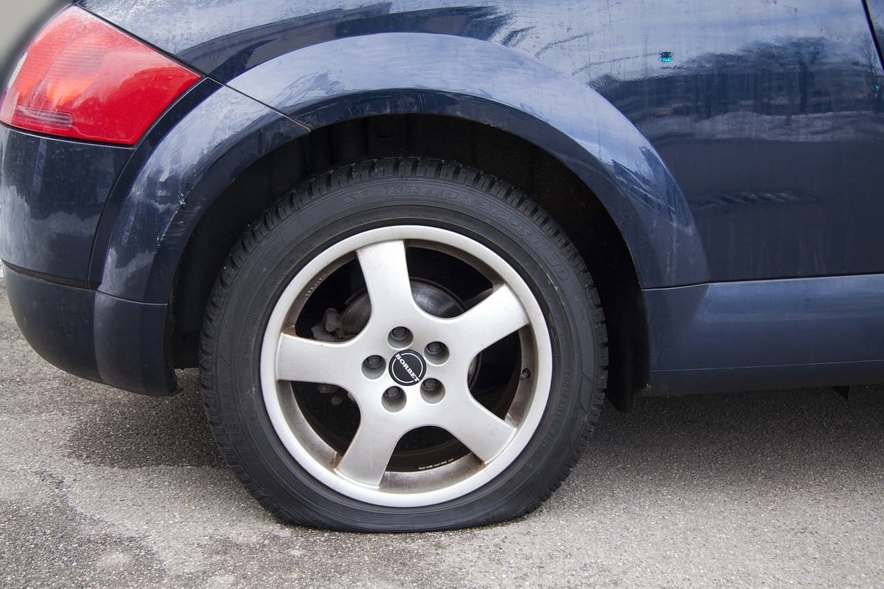 This is the “trend” that has replaced sliders on many sites. So if you take the first advice and scrap your slider, do not replace it with one of these. That’s like replacing a flat tire with a new flat tire that has the hole in a different place. The car still won’t drive..
What’s a Big Massive Image?
You’ve seen them. You might even have one. It’s when you arrive on the page, and the entire screen (sometimes even more than the entire screen) is filled up with a single – always very beautiful – picture of something.
On occasion, this image actually relates in some abstract or metaphorical way to that nonprofit’s mission (or business’ – some companies are doing this too…).
The problem with these Big Massive Images? They accomplish not a single one of the essential goals of a home page. Your website is for your visitors, not for your design team. Again, if you’d like to know what the essential goals of a website are, you can find out by asking here.
The other problem with Big Massive Images that are beautiful? I’ll answer that with another question: Is the work associated with your cause beautiful?
If you’re raising money for causes like animal cruelty, genital mutilation, human trafficking, poverty, abuse, cancer, natural disasters – these are not beautiful. You’re in the business of fighting ugliness in some form. So don’t use photos that are incongruent with your work. (That’s good advice for ALL fundraising, not just website home pages).
-
Slogans and Clever One-Line Mission Statements
Prospective donors don’t care about these. Yes, you need to be clear what your nonprofit does. But a mission statement and a “Welcome” message are the worst way to do that.
Now, having just a Big Massive Image AND no clever one-line mission statement? That’s worse. But you don’t want to be barely above awful.
-
CTA Buttons Written by Programmers
Submit. Subscribe. Download. Execute. Initialize. 
Ugh.
You’re in the business of giving people the opportunity to change someone’s life. Don’t leave a computer programmer’s idea of taking action be part of your message. You want a CTA (Call to Action) button that lights a fire under the person clicking it.
I don’t want to “submit” my information. I want to Join the Fight.
-
It Matters If It’s Black or White
Remember the Michael Jackson song? It may be true with people, but it’s far from true with webpage colors and font.
White text on black or dark backgrounds is the worst form of web page design – from a USER functionality standpoint. Again, as with so many design trends (noticing a pattern here?), black sites look cooler.
But white background with black text universally converts better. Why? They’re easier to read. Easier to navigate. More familiar with what people are used to (ever get a letter in the mail printed on black paper?)
Your page should have black text on white backgrounds, unless you’re using images. But putting text over images is often a problem for the same reason. Look – if people can’t read your messaging, then what good is it? This is about simple readability. Is looking cool more important?
-
The Evil Twin Effect
Especially with web design trends like the Big Massive Image contagion currently spreading among the unsuspecting masses, so many home pages fall into the same traps. The result?
They look just like all the other websites.
If every website looks the same, how are you going to stand out?
If someone is checking out your page for the first time, what do you want them to remember? What should stick in their mind? Even better – is there something simple you can ask of them that they are likely to do, so you can ensure they remember you?
Marketing has always been about getting attention. Looking just like everyone else is the worst way to do that.
-
Camo Donate Button
 If I can’t find your donate button in less than five seconds, then it’s too hard to find. Don’t camouflage your donate buttons.
If your colors are red, white, and blue, then your donate button should be GREEN, or some other ultra-clashing color. Don’t rely on your menu navigation bar either – unless you make the donate tab a different color from all the other items.
-
Hidden Menus
Mobile may be taking over the world, but hidden menus still suck. Why? Because users can’t find things easily.
Your web designer may be dancing down the aisle with that senseless little three-bar icon that sits sheepily in the top right corner of some sites (especially popular in Big Massive Image home pages), but you should be the one to cry out “I object” before you go along with this disastrous design marriage.
Show your menus. Use words. Tell people what to do, where to find it, where to go, and how to do what they came to do.
What Visitors Should Always See on Your Nonprofit’s Home Page
What nonprofit home pages shouldn’t do is pretty easy to fix. Just stop doing those things, and your site will be leaps and bounds better than it was.
But the next step is, putting systems and tools in place to help your visitors and accomplish your goals in greater numbers and with less effort required from your staff.
Here are four things that every homepage should have.
-
Instant Clarity of Mission
Again, a one-line statement crafted by a room of board members isn’t what this means. Clarity of mission must be communicated so that you answer one of the two essential questions every site visitor – including you – asks when visiting a new site.
 That question is: Where am I? (Or, why am I here?)
This is the first question your visitors want answered, whether they’re aware of it or not.
So answer it in a way they will understand. The best way to do this is with a verb-led action statement expressing what they would accomplish by helping your nonprofit.
If you don’t know what that means, this might be the most valuable thing you’ve read in months. Here’s an example:
Wrong Way: We serve homeless people by giving them food and basic necessities.
Much Better Way: Come with us next week and serve food and show love for the homeless.
It’s verb-led: “Come.” It’s specific: “next week.” It’s clear what we’ll be doing: “serve food.” It’s clear why we’re doing it: “show love.” And it’s clear who it’s for.
But best of all – it speaks to the visitor.
They read this and instantly know what your organization does. But they also know how they can get involved. Do you see how the second headline is leaps and bounds better than the first?
-
Instant Clarity of Direction
The next essential question every visitor – yes, again including you – asks when they visit a site is this one:
What do I do?
If they came looking to volunteer, how do I sign up to volunteer?
If they came looking to just see what you do, where do I go to find that?
No one comes to your website by accident. The internet has far too many byways and back alleys for that to happen. They were drawn here by something.
And once they get there, they will immediately have some kind of task they want to accomplish.
Does your site make it easy for them to accomplish it?
If not, your homepage stinks. Badly.
-
Changing Content
This is why so many web-design trends are failures. Because they don’t allow for easy flexibility.
Your home page needs a section where content can be updated. A place to put upcoming events, or new stories of impact, or big news about a law you just got passed.
The reasons to do this are numerous, ranging from making Google happy to making your site appear active to visitors, and many others in between.
Far too few nonprofit home pages are doing this.
-
Newsletter Signup – One That Works
By “works” I don’t mean the technology works.
“Works” means that your newsletter signup – probably the single most important function of a nonprofit’s website (no, it’s not the donate button, contrary to what many believe) – accomplishes the goals for which you have it.
There’s a lot more to be said about this too, but again, the point of this article has been simply to point out what makes a nonprofit home page an asset that bolsters your mission, or a liability that devours your staff’s time but produces little of value.
If you’d like to have a free conversation to learn more about any of the items on this list, contact me here and you can talk to me for an entire hour.